


Want to know how to 𝗛𝗔𝗡𝗗𝗟𝗘 𝗠𝗘𝗗𝗜𝗔 𝗤𝗨𝗘𝗥𝗜𝗘𝗦 𝗜𝗡 𝗥𝗘𝗔𝗖𝗧.𝗝𝗦?
Yes, you can with the help of the useMediaQuery() Hook. In this blog, we are going to discuss this hook
UseMediaQuery () Hook :
This is a CSS media query hook for React. It listens for matches to a CSS media query. It allows the rendering of components based on whether the query matches or not.
For Implementing this in your project you are required to install the required packages
First of all, you have to install the required dependencies using a command
𝗻𝗽𝗺 𝗶𝗻𝘀𝘁𝗮𝗹𝗹 𝗿𝗲𝗮𝗰𝘁-𝗿𝗲𝘀𝗽𝗼𝗻𝘀𝗶𝘃𝗲 --𝘀𝗮𝘃𝗲
Now you have to import useMediaQuery in your React project 𝗶𝗺𝗽𝗼𝗿𝘁 { 𝘂𝘀𝗲𝗠𝗲𝗱𝗶𝗮𝗤𝘂𝗲𝗿𝘆 } 𝗳𝗿𝗼𝗺 '𝗿𝗲𝗮𝗰𝘁-𝗿𝗲𝘀𝗽𝗼𝗻𝘀𝗶𝘃𝗲'
Now we understand it with the help of a basic example
import React from "react";
import { useMediaQuery } from 'react-responsive';
  const Hook = () => {

       const isDesktopOrLaptop = useMediaQuery({
              query : '(min-width: 1224px)'
         })

         return (
            <h1>Device Test </h1>
           <div> {isDesktopOrLaptop && <p>Desktop or Laptop size </p>} </div>
              )

    }
This will show the content based on whether the screen min width is 1224 px or not.
Now let's take another example :
Suppose we have a Navbar in which when we click on the Menu bar it will show up the Menu and hide when clicking next time, and in bigger screens, it works differently i.e. we don't want to show the menu bar and close it automatically if the screen size becomes larger than the required width
We can easily manage this using state but if we don't close the menu bar the state being set to true and it will show the menu bar on bigger width also which is not we required we can manage this using useMediaQuery() Hook
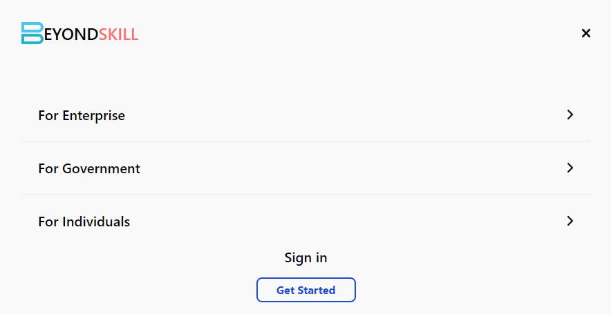
This is the Menu we want to show but want to close it on bigger widths
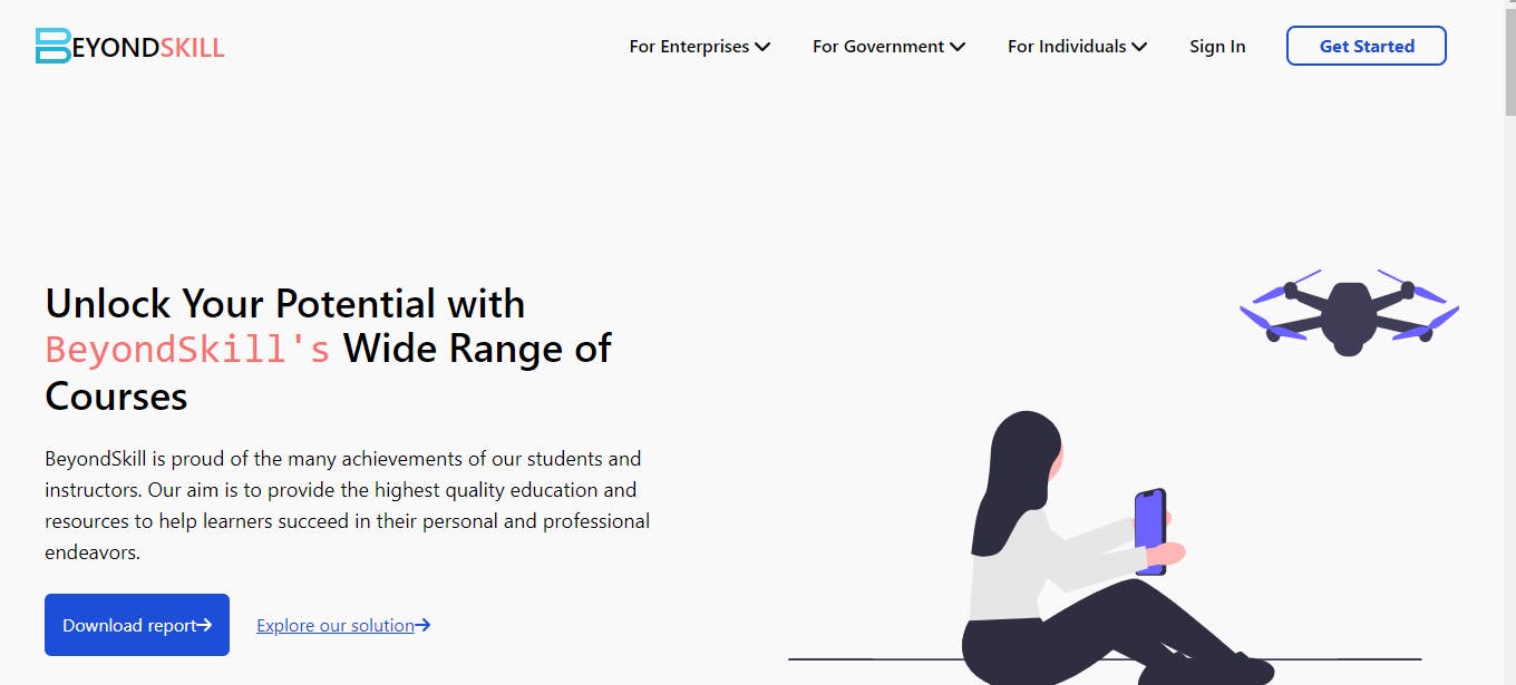
Now on bigger screens it may look like the below image
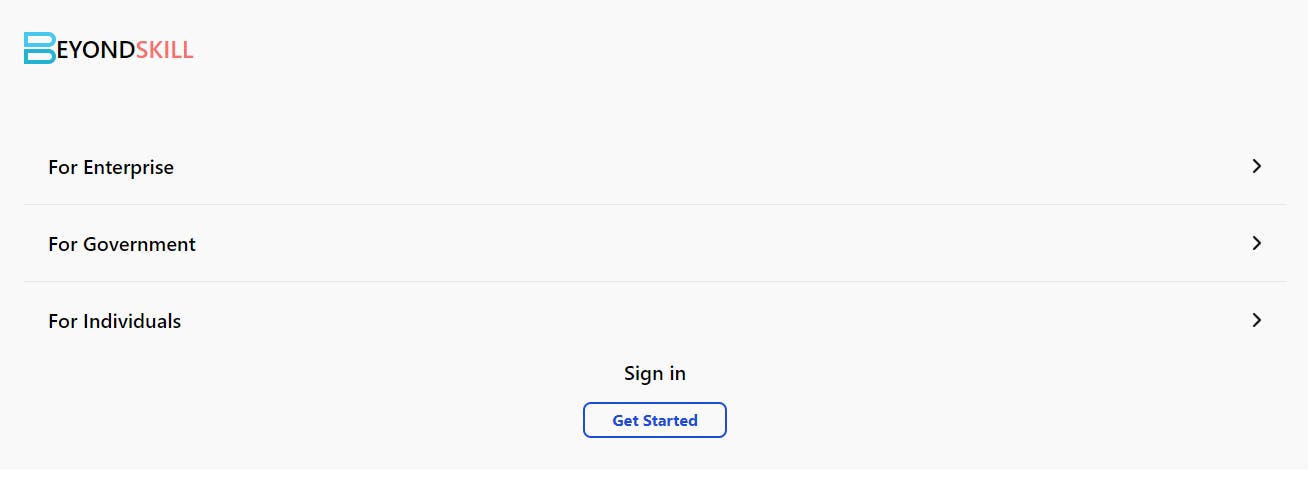
The problem here is that it remove the menu icon bar but not the content of Menu because we are setting it with state and that state is being managed on the basis of menu bar icon
To solve this problem :
export const Example = ({menu , setMenu}) => {
     const isTabletOrLaptop = useMediaQuery({ query: '(min-width: 1224px)' })
     useEffect(() => {
        if(isTabletOrLaptop){
            setMenu(false)
        }
     },[isTabletOrLaptop])

    return(
        <div className="flex justify-between items-center p-8 bg-bodyBg">
          <div className="flex">
            <img src={bold} alt="logo" className="w-8" />
            <span className="text-2xl font-semibold">EYOND<span                 className="text-2xl text-red-400">SKILL</span> </span>
      </div>
      <div>
        <FontAwesomeIcon icon={menu ? faTimes : faBars} className='cursor-pointer text-xl xl:hidden flex' onClick={() => {
          setMenu(prev => !prev)
          }}/>
      </div>
  </div>
import React,{useState} from "react";
import { Example } from './Example';
import Menu from './Menu';

export const App = () => {
    const [menu , setMenu] = useState(false);
    return(
        <>
        <Example menu={menu} setMenu={setMenu} />
        {menu && <Menu />}
        </>
    )
}
We use useMediaQueryHook() to solve this problem.
That's it for this blog on useMediaQuery() Hook .
You can read more about it [here](https://www.npmjs.com/package/react-responsive?activeTab=readme)
Thank you for Reading
Follow for more content like this
Social Media Links https://linkfree.eddiehub.io/uddinArsalan